You walk into your kitchen to start a peaceful, sun-drenched morning. The espresso is pulling, the fresh air is coming through the window, and you glance over at your wall-mounted smart tablet to check the day’s outlook.
Instead of clarity, you are instantly bombarded. Forty different glowing icons, fluctuating sensor graphs, a warning that a door sensor battery is at 82%, and a timeline of exactly when the hallway motion sensor was triggered last night.
A smart home is supposed to reduce your cognitive load, not add to it. When we cram our digital interfaces with every possible data point, we create screen fatigue. We take the organic, restorative spaces in our homes and turn them into stress-inducing command centres.
Your backend architecture might be doing some heavy lifting – maybe you have a Home Assistant VM running on a NAS, with a separate powerhouse running local LLMs – but your frontend interface doesn’t need to broadcast that complexity. The best user interfaces are practically invisible.
Here are three rules for decluttering your smart home dashboard to create a minimalist, calming UI.
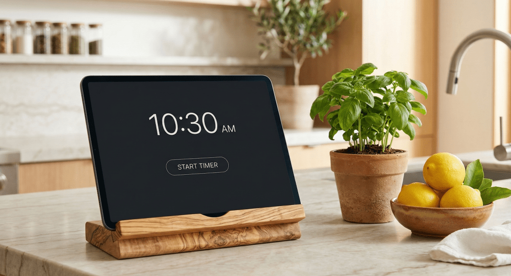
Rule 1: The “Glance Value” Principle (Kill the Vanity Metrics)
If you cannot read and process your dashboard from three feet away in under two seconds, there is too much on it.
When we first build out our smart homes, it is tempting to display everything simply because we can. But raw data is not the same as actionable information. Audit your current dashboard and ruthlessly eliminate “vanity metrics” that don’t require human intervention.
- Remove: The CPU temperature of your server, milliseconds of ping time, or the fact that the guest bedroom window has been closed for four consecutive days.
- Keep: Active timers, the current house mode and the immediate weather conditions so you know how to layer for your outdoor workout.
Rule 2: Embrace Conditional Visibility
A truly smart user interface adapts to the physical context of the house. You don’t need buttons for things you aren’t currently doing.
Instead of a static grid of every light and speaker in your home, use conditional cards to ensure elements only appear when they are actually relevant to your current environment.
- Contextual Media: Media controls should only take up screen real estate when the television or a smart speaker is actively playing.
- Health Alerts: A warning card about indoor air quality (CO2 or VOCs) should remain entirely hidden unless levels exceed healthy thresholds—like during a heavy cooking session or an indoor HIIT workout.
- Time-Based Routines: Your “Evening Lockup” and “Sleep Routine” buttons don’t need to clutter the screen at 10:00 AM. Set them to appear only after 8:00 PM.
Rule 3: Colour is a Tool, not a Decoration
Connect the digital interface to your physical environment. A dashboard shouldn’t look like a glowing neon spaceship control panel if the rest of your home is a warm, organic sanctuary. Implement a minimalist, intentional colour palette.
- The Canvas: Use dark, muted backgrounds—like deep charcoal, warm sand, or soft olive—to reduce screen glare and blend into the room’s aesthetic.
- The Baseline: Keep your standard icons monochromatic (crisp white or light grey) when their state is “off” or “normal.”
- The Highlights: Save your vibrant colours—like a rich terracotta or an Aegean blue—strictly for active states or alerts.
When colour is used sparingly, it becomes a powerful communication tool. If a single button is lit up in terracotta against a muted background, your brain instantly knows it requires attention without you even needing to read the label.
The Silent Assistant
The ultimate goal of home automation isn’t to build a screen you stare at all day. It is to build a system so reliable, natural, and intuitive that you barely need to look at an interface at all. Technology should be the silent assistant that gives you the mental space to focus on living well.
Take action today: Look at your primary dashboard. What is the one metric or button taking up space right now that you haven’t clicked or needed in over a week? Delete it and enjoy the visual quiet.
